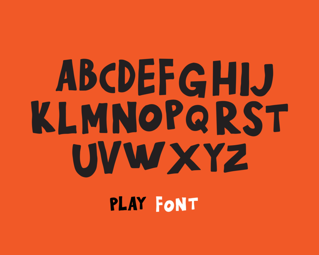
Broadway Font: The Glitz and Glamour of Typography
There’s something about the Broadway font that exudes glitz and glamour. It’s bold, beautiful, and eye-catching, making it the perfect choice for any design project that requires a touch of drama. In this article, we’ll take a closer look at the history, anatomy, and usage of the Broadway font, as well as some famous examples that have graced the stages of Broadway and beyond.
A Brief History of Broadway Font: From New York to the World
The Broadway font is a typeface that has become synonymous with the world of theater and entertainment. It was first created in the 1920s by Morris Fuller Benton for the American Type Founders company. The font was designed specifically for use in advertising posters and billboards in and around New York’s Broadway theater district. Its bold, blocky style was meant to catch the eye of passersby and draw attention to upcoming shows and events.
Over the years, the popularity of the Broadway font has spread beyond the theater district and into other areas of design, such as logos, packaging, and advertising. Today, it’s a beloved and recognizable font that’s used by designers all over the world.
The Anatomy of Broadway Font: Bold, Beautiful, and Eye-Catching
The Broadway font is characterized by its bold, blocky letterforms and exaggerated serifs. It’s a display font, meaning it’s meant to be used at larger sizes and for headlines, rather than for body text. The font’s caps are the most distinctive part of its anatomy, with each letter featuring a unique, exaggerated serif that gives the font its signature look.
The Broadway font is available in a range of weights and styles, from light and condensed to heavy and expanded. It’s also a versatile font that can be paired with a variety of other typefaces, depending on the desired effect.
How to Use Broadway Font: Tips and Tricks for Designers
When it comes to using the Broadway font in your designs, there are a few things to keep in mind. First, it’s important to use the font sparingly and in the right context. Because of its bold, attention-grabbing style, it can easily overpower other elements in a design if used too frequently or inappropriately.
Second, it’s important to pair the Broadway font with complementary typefaces that will enhance its impact rather than detract from it. Sans-serif fonts like Helvetica or Arial can provide a nice contrast to the ornate serifs of the Broadway font.
Finally, it’s important to experiment with different sizes, weights, and styles of the Broadway font to find the perfect combination for your design.
Famous Examples of Broadway Font: From Posters to Playbills
The Broadway font has been used in countless designs over the years, from posters and billboards to playbills and album covers. Some famous examples include the iconic poster for the musical “Chicago,” which features the Broadway font in bold red lettering against a black background.
Another well-known example is the logo for the Hard Rock Cafe, which uses the Broadway font to spell out the restaurant’s name in a style that’s both playful and sophisticated.
Embrace the Drama: Why Broadway Font is Perfect for Your Next Project
Whether you’re designing a poster for a local theater production or a packaging for a new product, the Broadway font can add a touch of drama and excitement to your design. Its bold, beautiful letterforms are sure to capture the attention of your audience and make a lasting impression.
So don’t be afraid to embrace the drama and use the Broadway font in your next project. With its rich history, distinctive style, and versatility, it’s sure to be a hit!


