
The Courier Font is one of the most iconic typefaces in the history of printing. It has become synonymous with the classic typewriter look and has made a significant impact on the way we perceive written communication. In this article, we’ll delve into the history, versatility, and charm of Courier Font.
The History of Courier Font
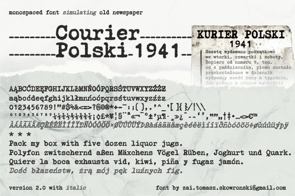
Courier Font was created in 1955 by Howard G. Kettler, a typographer at IBM. It was designed as a monospaced font, meaning that each character takes up the same amount of space, making it ideal for use with typewriters and other mechanical devices. The font was originally called “Messenger” but was later renamed “Courier” in honor of the courier delivery service.
The Classic Look of Courier
Courier Font has a distinctive look that is instantly recognizable. Its monospaced design, with each character occupying the same amount of space, gives it a uniform appearance that is ideal for conveying information in a clear and precise manner. The font’s use of serifs, or small decorative lines at the ends of each letter, adds a touch of elegance and sophistication to its overall look.
The Versatility of Courier
Courier Font’s versatility is one of its greatest strengths. It can be used in a wide range of applications, from formal documents like resumes and legal briefs to casual communication like emails and text messages. The font’s clean, simple lines make it easy to read, while its distinct look adds a touch of personality to any text.
Courier: A Writer’s Best Friend
For writers, Courier Font is a godsend. Its monospaced design makes it easy to format text for submission to publishers and editors, while its classic look adds a touch of nostalgia to the writing process. Many writers swear by Courier, saying that it helps them focus on their writing and blocks out distractions.
Courier in Pop Culture
Courier Font has become a staple in pop culture, appearing in movies, TV shows, and even video games. It’s often used to convey a sense of nostalgia or to evoke the look of old-fashioned typewriters. Courier has also been used in popular books like “The Catcher in the Rye” and “Fear and Loathing in Las Vegas,” cementing its place in literary history.
Embracing the Charm of Courier
While Courier Font may not be the most modern or flashy font out there, it has a charm and personality that is hard to resist. Its classic look and versatility make it a reliable choice for any type of communication, while its connection to the typewriter era adds a touch of nostalgia to the writing process. So why not embrace the charm of Courier and give your writing a touch of timeless elegance?
Courier Font may have been created over 60 years ago, but its influence on the world of typography and communication is still felt today. Whether you’re a writer, designer, or just a fan of classic typography, Courier Font is a font that is definitely worth considering. So why not give it a try and see for yourself the charm and versatility of this iconic typeface?


