
Fraktur Font and Its Rich History
Fraktur font is a typeface that has been capturing the hearts of designers and typography enthusiasts alike for centuries. With its ornate and intricate strokes, this font has managed to stand the test of time and remain popular to this day. In this article, we’ll explore the beauty of Fraktur font, its rich history, and how to use it in your own designs.
The Beauty of Fraktur Font
Fraktur font is a unique typeface that is known for its ornate and intricate strokes. It has a distinctive look that sets it apart from other fonts and makes it instantly recognizable. Its beauty lies in the way it combines elements of calligraphy and typography to create a cohesive and harmonious design. The font is perfect for use in book covers, invitations, and other design projects that require a touch of elegance and sophistication.
Rich History: From the 16th Century to Modern Times
Fraktur font has a rich history that dates back to the 16th century. It originated in Germany and was used extensively in printing and publishing during the Renaissance period. The font was particularly popular in the Lutheran Church, where it was used for printing Bibles and other religious texts. Today, Fraktur font is still used in modern design projects, and its enduring popularity is a testament to its timeless appeal.
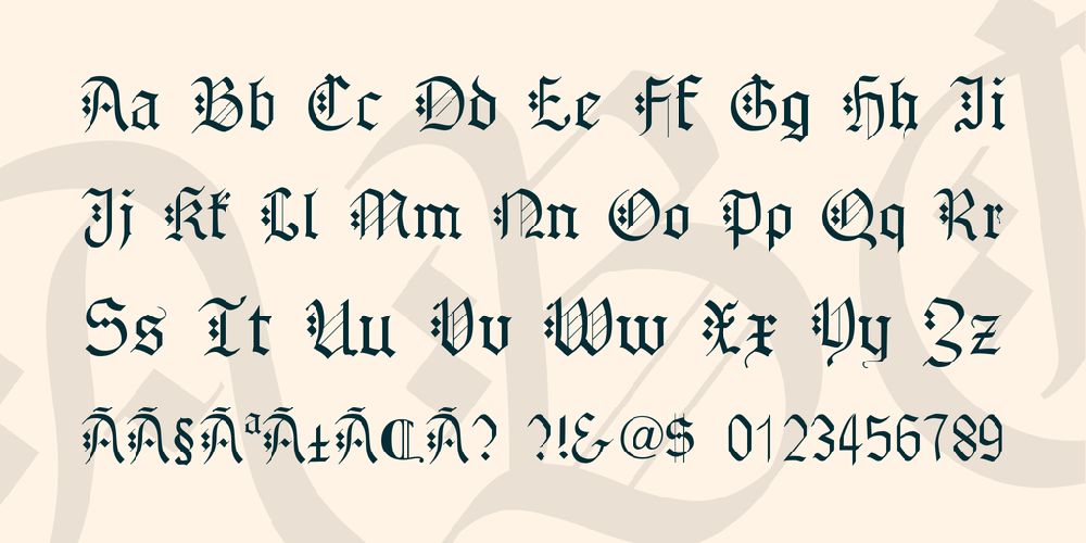
The Characteristics of Fraktur Typeface
Fraktur font is known for its intricate and ornate strokes, as well as its distinctive letterforms. The font features sharp angles, pointed serifs, and a high degree of contrast between the thick and thin strokes. It is often used for headlines and titles, as it has a commanding presence on the page. Fraktur font is also highly legible, making it a popular choice for book design and other text-heavy projects.
How to Read and Write in Fraktur
Reading and writing in Fraktur font can be a challenge for those who are not familiar with the typeface. However, with a bit of practice and patience, anyone can learn to read and write in Fraktur. The key is to start with the basics, such as learning the letterforms and understanding how they fit together. Once you have a good grasp of the basics, you can move on to more advanced techniques, such as ligatures and diacritics.
The Enduring Popularity of Fraktur in Design
Despite its long history, Fraktur font remains popular in design circles today. It is a versatile typeface that can be used in a variety of design projects, from logos and branding to book covers and invitations. Its timeless appeal and unique look make it a favorite among designers who are looking to add a touch of elegance and sophistication to their work.
Using Fraktur in Your Own Designs: A Tutorial
If you’re interested in using Fraktur font in your own designs, there are a few things you should keep in mind. First, make sure you choose the right font for your project. There are many different variations of Fraktur font, each with its own unique look and feel. Once you’ve chosen your font, experiment with different layouts and color schemes to create a design that is both beautiful and functional.
Fraktur Font: A Timeless Typeface
Fraktur font is a timeless typeface that has captured the hearts of designers and typography enthusiasts for centuries. Its ornate and intricate strokes, combined with its rich history, make it a popular choice for a variety of design projects. Whether you’re designing a logo, a book cover, or an invitation, Fraktur font is sure to add a touch of elegance and sophistication to your work. So why not give it a try and see what you can create?


