Get Funky with Grunge Font
Grunge Font is a typography style that has been taking the design world by storm in recent years. With its bold, edgy, and sometimes even borderline messy appearance, it’s no surprise that it has become a popular choice for designers and creatives who want to add a funky and unique touch to their work.
From album covers to movie posters, editorial layouts to advertising campaigns, grunge font has proven to be a versatile and eye-catching choice for a wide range of projects. Whether you’re a seasoned designer or just starting out, adding a few grunge fonts to your collection can help take your work to the next level.
The Art of Grunge Typography
Grunge typography is all about embracing imperfection and rawness. It’s not about following strict rules or creating perfectly polished designs. Instead, it’s about conveying a certain mood or emotion through the use of typography that looks like it has lived a life of its own.
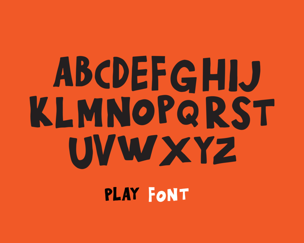
Grunge fonts often feature irregular shapes, rough edges, and textures that mimic the look of distressed or worn-out materials like concrete, metal, or paper. They also tend to use bold, chunky letterforms with heavy strokes and sans-serif typefaces that give them a modern, industrial edge.
Bold and Edgy: Grunge Font Explained
Grunge font is not for the faint of heart. It’s a bold and edgy typography style that can make a statement like no other. It’s perfect for projects that need to stand out and catch people’s attention, like event posters, book covers, or branding materials for fashion or music brands.
Grunge font can also be used to add a sense of nostalgia or retro vibe to a design, especially when combined with vintage-inspired graphics or muted color palettes. It’s a great way to add personality and character to your work, and to show that you’re not afraid to take risks and break the rules.
How to Use Grunge Font for Eye-Catching Designs
To use grunge font effectively, it’s important to keep a few things in mind. First, make sure that the font you choose matches the mood and style of the project you’re working on. If you’re designing a poster for a heavy metal concert, for example, you might want to use a font that looks distressed and rough around the edges.
Second, don’t be afraid to experiment with different textures and colors to create a truly unique design. Grunge font works well with bold graphics, photographic images, and even handwritten elements, so feel free to mix and match to create something truly eye-catching and memorable.
The History of Grunge Font: From Grunge Music to Modern Design
Grunge font has its roots in the grunge music scene of the 1980s and 1990s. It was a style that rejected the polished and commercialized aesthetic of mainstream rock and embraced a raw, DIY approach to music-making. This same aesthetic carried over into the art and design world, with designers adopting a similar approach to typography and layout.
Today, grunge font has evolved into a popular style that can be seen in everything from streetwear fashion to high-end editorial design. It’s a testament to the enduring appeal of the grunge ethos, and a reminder that sometimes the most powerful and effective designs are the ones that don’t follow the rules.
Top 10 Grunge Fonts You Need in Your Collection
- Bebas Neue
- Ammonite
- Black Chancery
- Akzidenz-Grotesk
- Garamond
- Helvetica
- Avenir
- Gotham
- Franklin Gothic
- Futura
These are just a few of the many grunge fonts available to designers and creatives. Each one has its own unique personality and style, so be sure to experiment and find the ones that work best for your projects.
Grunge font is a typography style that’s here to stay. With its bold, edgy, and sometimes even messy appearance, it’s a great way to add personality and character to your designs. Whether you’re working on a poster, album cover, or branding materials, grunge font can help take your work to the next level. So, get funky and embrace the imperfections with this timeless and versatile typography style!


