
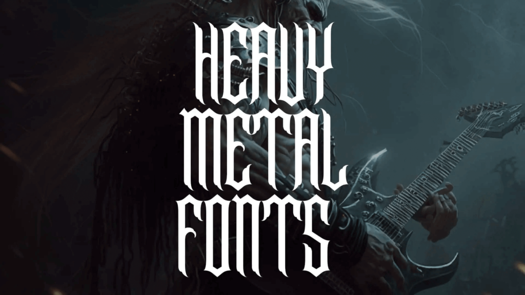
Unleashing the power of heavy metal fonts
If you’re looking to inject your designs with a touch of raw energy and power, look no further than heavy metal fonts. These bold, metallic typefaces are the go-to choice for designers looking to create visually striking designs that pack a punch. From album covers to clothing designs, metal fonts have become a staple in the world of graphic design. But where did these iconic typography styles come from, and what makes them so unique? Let’s explore the exciting world of heavy metal fonts.
The history behind the iconic typography
Metal fonts first gained popularity in the 1970s and 1980s with the rise of heavy metal music. Bands like Black Sabbath and Iron Maiden used bold, gothic lettering for their album covers, which quickly became synonymous with the genre itself. The popularity of these lettering styles spread beyond the music industry, and soon, metal fonts were being used in everything from advertising campaigns to comic books. Today, metal fonts have become a staple in the design world and continue to inspire designers around the globe.
Breaking down the anatomy of a metal letter
Metal fonts are known for their bold, block-like shapes and sharp edges. They often feature intricate details such as spikes, thorns, and jagged edges, which give them a menacing, almost aggressive appearance. The use of metallic textures and colors further emphasizes their raw, powerful aesthetic. While metal fonts can vary in style and complexity, they all share the same basic anatomy: a solid, rectangular shape, with sharp, angular edges that create a sense of tension and energy.
Tips and tricks for using metal fonts in design
When using metal fonts in design, it’s essential to keep their unique style in mind. Metal fonts work best when paired with other bold, graphic elements, such as abstract shapes or strong, contrasting colors. They’re perfect for creating attention-grabbing headlines or adding an edge to your designs. When using metal fonts, it’s crucial to balance their boldness with other design elements. Avoid using too many competing fonts or busy backgrounds, which can overwhelm the viewer and detract from the impact of the metal font.
Top 5 heavy metal fonts for your next project
If you’re looking to incorporate metal fonts into your next design project, here are five of the best to consider:
- Slayer – Known for its sharp, jagged edges and bold, Gothic style, Slayer is a classic heavy metal font that never goes out of style.
- Iron Maiden – This iconic font features intricate details, such as spikes and thorns, and is perfect for creating a sense of raw energy and power.
- Metallica – Another classic metal font, Metallica features bold, block-like letters with sharp, angular edges that create a sense of tension and movement.
- Judas Priest – With its bold, Gothic-style letters and intricate details, Judas Priest is the perfect choice for creating a sense of drama and excitement.
- Megadeth – Known for its sharp, angular letters and metallic textures, Megadeth is a bold, attention-grabbing font that’s perfect for creating impact.
Let your creativity shine with bold, metallic typography
In conclusion, heavy metal fonts are a powerful tool for designers looking to create bold, eye-catching designs. With their sharp, angular shapes and metallic textures, they’re perfect for injecting a sense of raw energy and power into your work. By keeping their unique style in mind and pairing them with complementary design elements, you can create designs that are both visually stunning and impactful. So let your creativity shine and unleash the power of metal typography in your next project.


