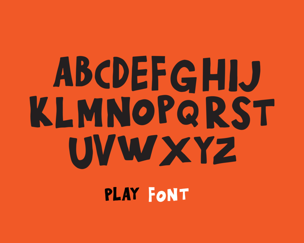
If you’ve ever seen a sign or poster with a font that looks like it was scribbled by a hobo, chances are it’s the Hobo Font. This quirky typeface has been popular for over a century and has a fascinating history. In this article, we explore the origins, design, and cultural impact of the Hobo Font, and share tips on how to use it in your own designs.
Hobo Font: The Quirky Typeface
The Hobo Font is a sans-serif typeface with a distinctive, hand-drawn quality. It was designed in 1910 by Morris Fuller Benton, a prolific American typeface designer. The font features rounded edges, a wide stance, and a slightly condensed design. It was originally released by the American Type Founders (ATF) and quickly became popular for its unique look and feel.
From Train Hoppers to Typography
The Hobo Font draws inspiration from the world of hobos and train hoppers. In the early 20th century, many Americans were forced to travel across the country in search of work. They became known as hobos, and they would often hop on trains and ride them to different cities. These hobos would often mark their territory with a distinctive squiggle, which inspired the design of the Hobo Font.
The Story Behind the Name
The name “Hobo” for the typeface was not chosen by the designer, but rather by the marketing department at American Type Founders. They saw the font’s playful design and felt that the name “Hobo” would be a good fit. Despite the name’s connotation with homelessness and destitution, the Hobo Font has become a beloved and recognizable typeface.
The Bold and Daring Design
The Hobo Font’s bold and daring design has made it a favorite among designers and advertisers. Its hand-drawn quality gives it a sense of authenticity and playfulness, making it ideal for use in branding and advertising campaigns. The font’s wide stance and rounded edges also make it easy to read, even from a distance.
Hobo Font in Pop Culture
The Hobo Font has appeared in countless movies, TV shows, and advertisements over the years. Its distinctive design makes it instantly recognizable, and it has been used to convey a wide range of messages. It has appeared in everything from ads for Coca-Cola to movie posters for Star Wars.
How to Incorporate Hobo Font in Your Design
If you want to incorporate the Hobo Font into your designs, there are a few things to keep in mind. First, use it sparingly. The font’s distinctive design can quickly become overwhelming if overused. Second, pair it with other typefaces to create contrast and balance. And finally, use it in designs that convey a sense of playfulness and authenticity.
The Hobo Font is a testament to the power of creativity and inspiration. From the train hoppers of the early 20th century to the world of typography and design, this quirky typeface has left an indelible mark on popular culture. Whether you’re a designer or simply a fan of unique fonts, the Hobo Font is a must-know.


