Movie posters are an essential part of the film industry, and they play a critical role in attracting audiences to theaters. They use typography and graphics to convey the tone, genre, and premise of a movie. Choosing the right font is crucial in creating a memorable and eye-catching poster. In this article, we will explore the art of movie poster font, classic fonts that never go out of style, and font trends that will take over the big screen.
The Art of Movie Poster Font
Movie poster fonts are all about impact and capturing the essence of a film. They need to communicate the mood, genre, and the overall style of the movie in a single glance. A great movie poster font can create intrigue, excitement, and anticipation among viewers. It is more than just words on paper; it is a powerful visual tool that should be carefully crafted to express the movie’s essence.
How to Pick the Perfect Font
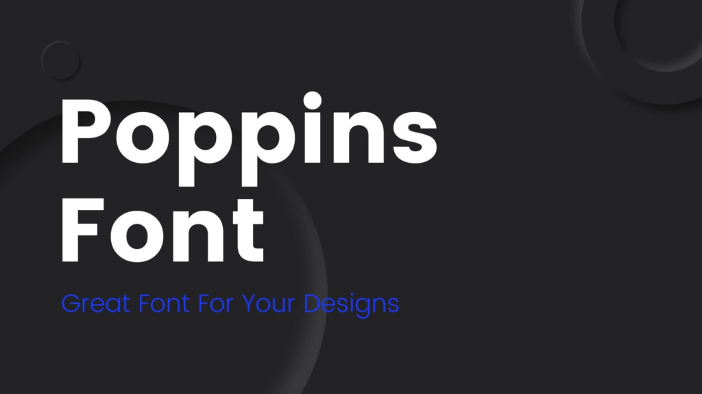
Choosing the right font for a movie poster is a crucial step in the design process. The font should complement the style, genre, and mood of the movie. The designer needs to consider the readability, legibility, and the impact of the font on the audience. Serif fonts are great for classical and dramatic movies, while sans-serif fonts work well for modern and sleek films.
Classic Fonts That Never Go Out of Style
Some fonts have become iconic and have stood the test of time. These fonts have been used in some of the most famous movie posters of all time. The classic fonts include Helvetica, Futura, Garamond, and Bodoni. These fonts have been used for decades in the movie industry, and they still look fresh and modern today.
The Secret to Creating Memorable Titles
The movie title is the most crucial part of the poster, and it needs to be memorable. The designer needs to create a title that captures the essence of the movie and makes it stand out. The title needs to be legible, clear, and easy to read. The font should complement the overall design and be consistent with the movie’s genre and style.
The Importance of Legibility and Readability
Legibility and readability are critical factors in choosing a font for a movie poster. The font needs to be easy to read from a distance, and the audience should be able to read it quickly. The designer needs to choose a font that is not too busy and does not distract from the overall design. A font that is too fancy or complicated can be challenging to read and may turn off potential viewers.
Font Trends That Will Take Over the Big Screen
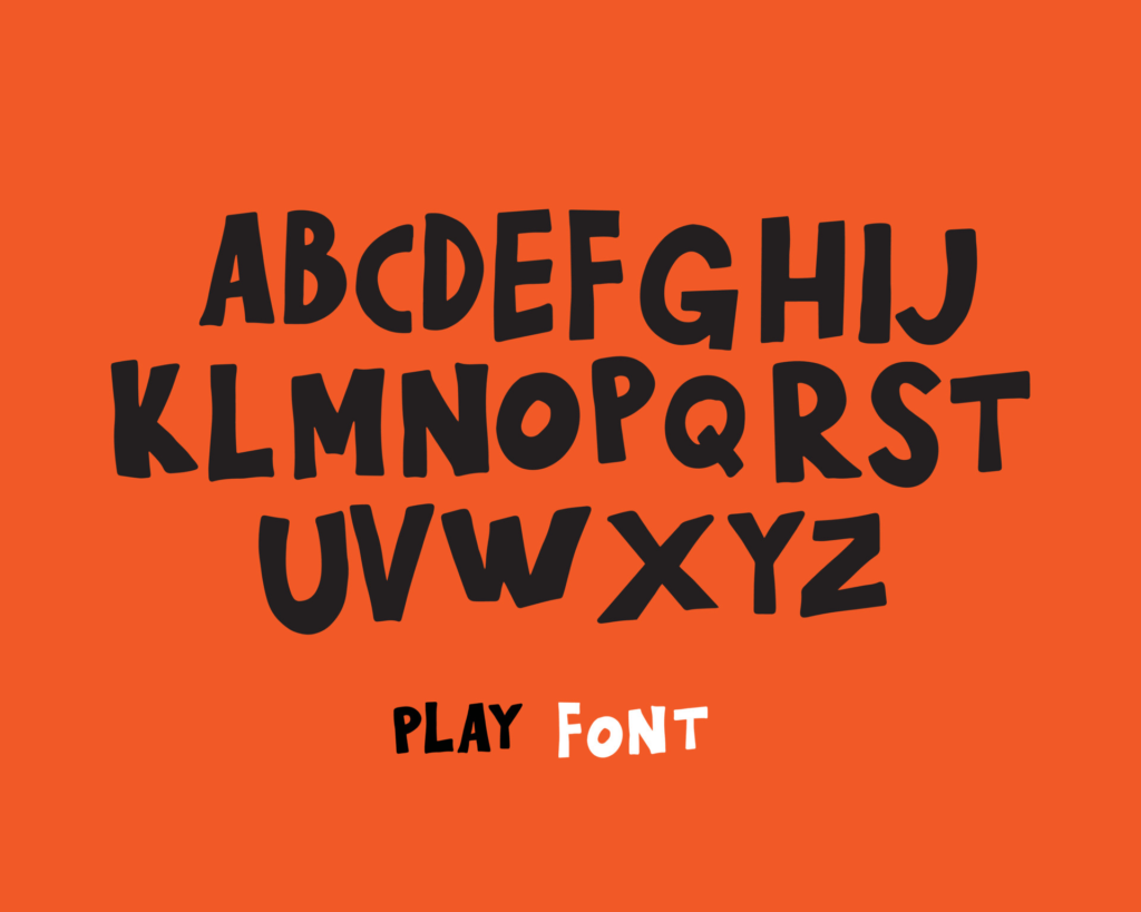
Font trends in the movie industry are constantly evolving, and designers need to stay up-to-date with the latest styles and trends. Some of the latest trends include hand-drawn fonts, 3D typography, and vintage styles. These fonts are being used to create more unique and distinctive movie posters that stand out from the crowd.
In conclusion, the art of movie poster font is a crucial part of the film industry, and designers need to carefully craft the typography to capture the essence of the movie. Choosing the right font, considering legibility and readability, and creating memorable titles are all important factors in creating a successful movie poster. Whether it’s classic fonts or the latest trends, the font is a vital component of the movie poster and can make or break the design.


