
The Nike brand is unmistakable, with its bold swoosh logo and iconic slogan, “Just do it.” However, the font used in the Nike logo and marketing materials is just as important to the brand’s success. Over the years, Nike’s font has evolved, but it has always remained distinctive and instantly recognizable. In this article, we’ll explore the history of Nike’s font, its impact on the brand, and why it has become such an iconic part of Nike’s identity.
The story of the swoosh
In 1971, Nike co-founder Phil Knight was looking for a logo that would set the brand apart from its competitors. He turned to a graphic design student named Carolyn Davidson, who created the now-famous swoosh in just 17.5 hours. The swoosh represents the wing of Nike, the Greek goddess of victory, and it has become one of the most recognizable logos in the world.
How Nike’s font evolved
When Nike was first founded, its marketing materials used a simple sans-serif font. However, in the 1980s, the company began experimenting with custom fonts that would give its advertising a more distinctive look. The font that eventually became Nike’s standard was a modified version of Futura Bold, a typeface that had been popular since the 1920s.
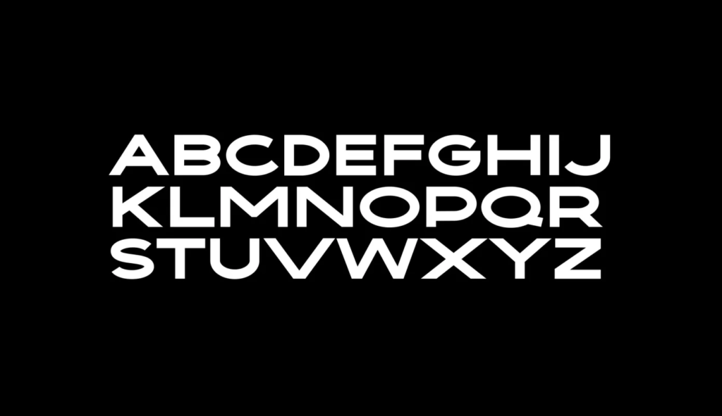
The birth of “Futura Bold”
Futura Bold was designed by Paul Renner in 1927, and it quickly became one of the most popular typefaces of the 20th century. The font was a bold, geometric sans-serif that was easy to read and had a modern, futuristic look. When Nike decided to modify the font for its own use, it added a slant to the letters and made other adjustments to give the font a unique look.
Why Nike’s font is iconic
Nike’s font is iconic for several reasons. First, it is bold and distinctive, and it stands out from other fonts used by competitors. Second, it is instantly recognizable, and consumers associate it with the Nike brand. Finally, the font has a modern, futuristic look that fits well with Nike’s focus on innovation and cutting-edge technology.
The impact of typography on branding
Typography plays a crucial role in branding, and Nike’s font is a perfect example of this. A well-designed font can help a brand stand out from its competitors, create a distinctive look and feel, and communicate the brand’s values and personality. When used consistently across all marketing materials, a font can become a powerful tool for building brand recognition and loyalty.
“Just do it” with Nike’s font
Nike’s font has become so iconic that it is now synonymous with the brand’s slogan, “Just do it.” The bold, no-nonsense look of the font perfectly captures the spirit of the slogan, which encourages consumers to take action and pursue their goals. Whether you’re hitting the gym, running a marathon, or simply trying to achieve your personal best, Nike’s font and slogan are there to inspire you to “just do it.”
Nike’s font is more than just a typeface – it’s a crucial part of the brand’s identity. From the birth of the swoosh logo to the evolution of the Futura Bold font, Nike’s typography has played a major role in the company’s success. Whether you’re a fan of the brand or simply appreciate good design, Nike’s font is a great example of how typography can be used to create an instantly recognizable and iconic brand.


