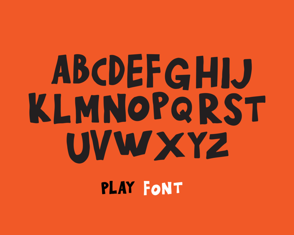
Aye, Aye, Mateys! Let’s Talk “Pirate Font”
Ahoy there, me hearties! Are you ready to set sail on a swashbuckling adventure with “pirate font”? This typeface style has become synonymous with all things pirate-related and can add a touch of adventure to any design project. In this article, we’ll explore the history of pirate font, where to find the best ones, and how to use them effectively in your designs. So, hoist the Jolly Roger and let’s dive in!
What is “Pirate Font” and How Did It Start?
Pirate font is a typeface style that mimics the handwriting of pirates from the Golden Age of Piracy, which spanned from the 1650s to the 1730s. These letters were often written in a bold, cursive style that was easily recognizable. The font has since become a popular choice for all things pirate-related, from movies and TV shows to video games and merchandise.
The origins of pirate font can be traced back to the early 20th century, when it was first used in advertisements for pirate-themed movies. As the popularity of these movies grew, so did the use of pirate font in other areas of pop culture. Nowadays, you’ll find pirate font everywhere, from pirate-themed websites to Halloween decorations.
X Marks the Spot: Where to Find the Best Pirate Fonts
If you’re looking for pirate fonts, there are plenty of places to search for them. One of the most popular sites is dafont.com, which has a huge selection of free pirate fonts available for download. Another great site is fontspace.com, which also has a large selection of pirate fonts.
If you’re looking for a more professional quality pirate font, sites like Myfonts.com and Creative Market offer paid options that are often more detailed and customizable. Additionally, Adobe Creative Cloud subscribers can access a variety of pirate fonts through Adobe Fonts. No matter where you look, there is sure to be a pirate font that fits your needs.
Shiver Me Timbers! Tips for Using Pirate Fonts
When using pirate fonts, it’s important to keep a few things in mind to ensure that your design looks polished and professional. First and foremost, limit the use of pirate font to headings and titles, as using it for body text can quickly become overwhelming. Additionally, make sure to pair your pirate font with a more traditional sans-serif or serif font to create a balanced design.
Finally, don’t be afraid to play around with size, color, and texture to create a unique design. Pirate font works well with distressed or rough textures, and can look great in gold or bronze colors.
Ahoy, Landlubbers! Pirate Fonts for Non-Pirate Designs
While pirate font is most often associated with pirate-themed designs, it can also be used in non-pirate designs to add a touch of adventure. For example, a travel website could use pirate font to create a sense of adventure and exploration. Similarly, a children’s book cover could use pirate font to create a whimsical and playful design.
Pirate font is a versatile typeface that can be adapted to fit a variety of design needs. Don’t be afraid to experiment with it in different contexts to see what works best for your project.
Hoist the Jolly Roger and Set Sail with Pirate Fonts!
In conclusion, pirate font is a fun and versatile typeface that can add a touch of adventure to any design project. Whether you’re creating a pirate-themed website or simply want to add some character to a design, pirate font is a great option. Remember to limit its use to headings, pair it with a traditional font, and experiment with size, color, and texture. So, hoist the Jolly Roger and set sail on your next design adventure!


