
Have you ever seen a font and immediately felt transported to a world of kings and queens, of grandeur and majesty? That’s the power of royal fonts. These elegant and regal typefaces can elevate any piece of writing or design, adding a touch of sophistication and class. In this article, we’ll explore the history and intricacies of royal fonts, and give you some tips on how to use them to make your work fit for a king.
The Majestic World of Royal Fonts
Royal fonts are those typefaces that evoke a sense of nobility, elegance, and sophistication. They are often associated with the grandeur of royalty and the opulence of palaces and castles. These fonts can come in a variety of styles, from calligraphic scripts to bold serifs and intricate swirls. Their use can elevate any piece of writing or design, adding a touch of class and refinement.
The Tale of How Royals Wrote
In the past, royal scribes would write using quills and ink on parchment or vellum. They would spend hours carefully crafting each letter, using their skills to create stunning works of art. Over time, the technology evolved, and printing presses were invented. This led to the creation of typefaces, which became more elaborate and ornate as the demand for more decorative fonts grew.
From Quills to Pixels: A History of Typefaces
The history of typefaces is a long and fascinating one. From the first printing presses in the 15th century to the digital fonts of today, typography has undergone many changes and evolutions. Each period in history has its own unique style of typeface, from the Gothic fonts of the Middle Ages to the Art Deco fonts of the 1920s.
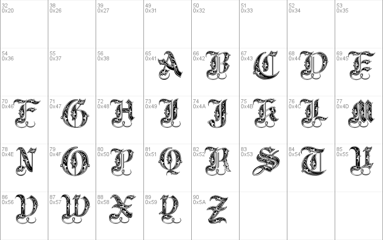
The Power of Serifs and Swirls
One of the defining characteristics of royal fonts is the use of serifs and swirls. Serifs are the small lines or flourishes that extend from the ends of letters, while swirls are decorative elements that add flair and elegance to typefaces. These design elements can make a font look more regal and luxurious, and are often used in titles, headings, and other important text.
How to Add a Touch of Royalty to Your Writing
If you want to add a touch of royalty to your writing, there are a few things you can do. First, choose a font that has a regal and elegant feel to it. Second, use serifs and swirls to add decorative elements to your text. And third, use color and formatting to make your writing stand out. By following these tips, you can create a piece of writing that looks fit for a king.
Exploring the Best Royal Fonts for Your Next Project
There are many royal fonts to choose from, each with its own unique style and personality. Some popular choices include Trajan, Garamond, and Baskerville. These fonts are elegant, sophisticated, and have stood the test of time. Other options include calligraphic scripts like Edwardian Script or modern serifs like Didot. Whatever your style, there’s sure to be a royal font that fits your needs.
In conclusion, royal fonts are a powerful tool in the world of typography. These elegant and regal typefaces can elevate any piece of writing or design, adding a touch of sophistication and class. By understanding the history and intricacies of royal fonts, you can use them to create stunning works of art that are fit for a king. So why not try using a royal font in your next project and see the difference it can make?


