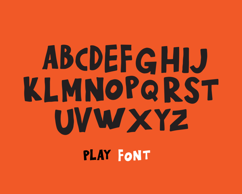
The Starbucks font has become an iconic symbol of the world’s most famous coffee chain. From the moment you set foot in a Starbucks, the font is instantly recognizable, and it has become an integral part of the company’s branding. In this article, we will explore the history, evolution, and impact of the Starbucks font, as well as why we love it so much.
The iconic Starbucks font
The Starbucks font is one of the most recognizable fonts in the world, known for its bold and unique design. The font is a custom creation that was designed specifically for Starbucks and has become an integral part of the brand’s identity. The font is used on all Starbucks products, from cups and bags to signage and advertising materials, making it a familiar sight for coffee lovers worldwide.
A look at its history
The Starbucks font was first created in 1971 by Terry Heckler, a graphic designer who was tasked with creating a logo for the new coffee shop chain. The original logo featured a brown circular seal with a stylized image of a mermaid or siren in the center, surrounded by the words “Starbucks Coffee Tea Spice.” The font used in the original logo was known as “Cargo,” a popular font of the time.
The birth of the siren
The siren or mermaid featured in the original Starbucks logo was inspired by a 16th-century Norse woodcut of a twin-tailed mermaid, which Heckler had found in an old book. The siren was chosen as a symbol of the allure and romance of coffee, and it has since become synonymous with the Starbucks brand. Over the years, the siren has undergone a few minor changes to her design, but she remains an iconic part of the Starbucks logo today.
The evolution of the font
Over the years, the Starbucks font has undergone several changes to its design, reflecting the changing times and trends in typography. The original Cargo font was replaced with a custom typeface known as “Siren,” which was designed to complement the siren logo. In 2010, the font was updated again, this time with a more streamlined design known as “Starbucks Sharp.” Today, the font is used in a variety of ways, from decorative scripts to bold headlines, but its Starbucks origins are always recognizable.
The impact on branding
The Starbucks font has had a significant impact on the brand’s identity and recognition. The font’s bold and unique design is instantly recognizable, making it easy for customers to spot a Starbucks location from a distance. The font is also used consistently across all of Starbucks’ products and marketing materials, reinforcing the brand’s identity in the minds of consumers.
Why we love it!
There are many reasons why we love the Starbucks font. For one, it is a modern and attractive font that looks great on everything from coffee cups to billboards. The font is also incredibly versatile, working equally well for headlines, body copy, and decorative scripts. But perhaps the biggest reason we love the Starbucks font is that it represents something more than just a coffee shop chain. The font and the siren symbolize the romance and allure of coffee, creating an emotional connection with customers that goes beyond just a hot drink.
In conclusion, the Starbucks font is an iconic symbol of the world’s most famous coffee chain. Its history, evolution, and impact are all part of what makes it such a beloved and recognizable font. Whether you’re grabbing a latte on the go or sitting down to enjoy a cup in-store, the Starbucks font is always there, reminding us of the romance and allure of coffee. So next time you see that familiar font, take a moment to appreciate all that it represents.


